Building Paradime's Year-in-Review with AI in 10 Days
What started as casual experimentation with Gemini 3.0 became a shipped product in 10 days - built entirely by a creative designer with zero coding background. This is the story of how I used AI tools at Paradime, and practical lessons for designers exploring AI-assisted development.

Hannah Liu
·
5
min read

TL;DR
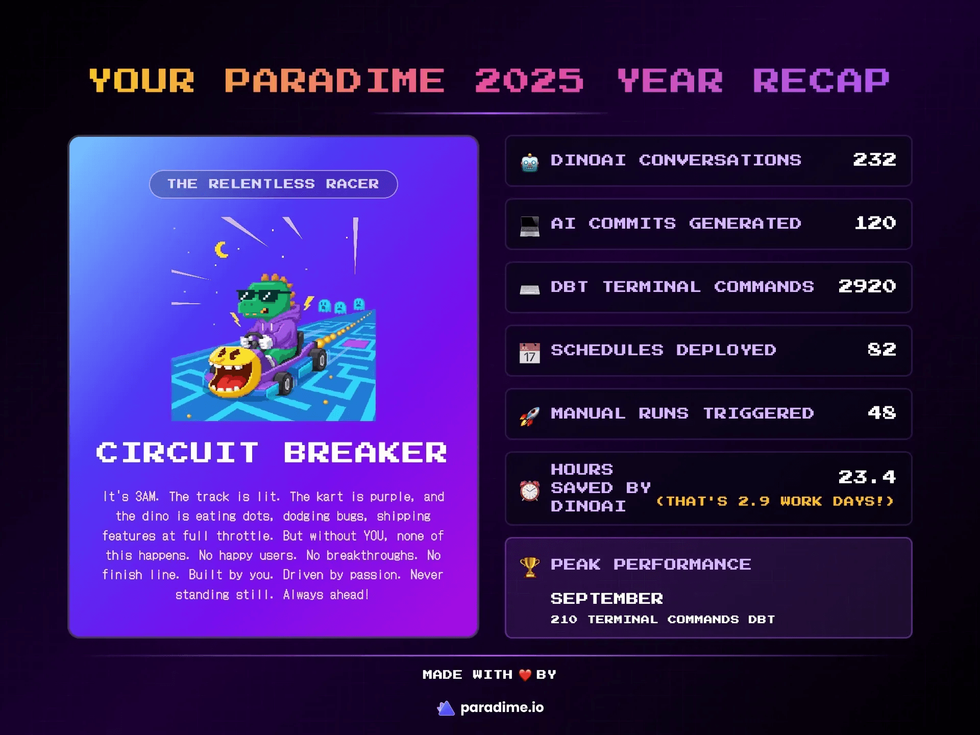
Timeline: 10 days, 226 iterations
Tools: Claude, Figma Make, Gemini & Nano Banana, ChatGPT
Team: Solo designer (no engineering support for build)
Output: Interactive Year-in-Review with behavioral archetypes and gamified UX
Tech Stack: Cube API, BigQuery, dbt™, Figma Embed
Key Learning: AI accelerates execution, not strategic thinking
What users see in action
Introduction
I am Hannah, a creative designer in the Paradime team. I am responsible for Paradime's brand, marketing and creative design. I have always used Framer, Figma, Lottielab regularly and a few others applications sparingly for my creative work. However, in November 2025, I faced an unprecedented challenge. I had to ship the design and execution of Paradime Wrapped, a curated "Spotify Wrapped" like Year-in-Review for Paradime users. It had to be fun, eye-grabbing, and aligned with our DinoAI arcade-like design, that we started rolling out from Big Data London, 2025. This is the story of how I went from concept, experimentation, building a AI-native design workflow to go-live. I am not a developer but I was able to use AI to empower me to produce the vision and design thinking I had in my mind.
The Spark: From Experiment to Product
Last November, when Gemini 3.0 launched, I started experimenting. Not with any grand plan—just pure curiosity about what this new AI tool could actually do.
I built a dbt™ explainer app for non-engineers. Then an icon animation library. Then a small game. Each project taught me something about AI's strengths and limitations.
They were just experiments.
dbt™ explainer app for non-engineers
Small game with Dino theme
Then in late November, Paradime needed a Year-in-Review feature for our users. Fast. The usual approach would take our engineering team 4+ weeks to build.
But I'd been experimenting with AI tools for weeks. I'd learned what they could do. I thought: what if I just built it myself?
226 iterations and 10 days later, we shipped it. Built entirely with AI tools. By me, a designer with zero coding background.
The Initial Challenge
Paradime had never done a Year-in-Review before. Around November, we started talking about creating one for our users. The initial plan was straightforward: I'd design some visuals, our engineering team would build it, probably as a simple slideshow format. Nothing too ambitious considering our limited time.
But I was deep in my Gemini experiments at the time, and something clicked. We've always used arcade aesthetics in our branding. We had this amazing arcade machine illustration from our Big Data London booth. And we thought: what if we could turn a Year-in-Review into an actual arcade experience?
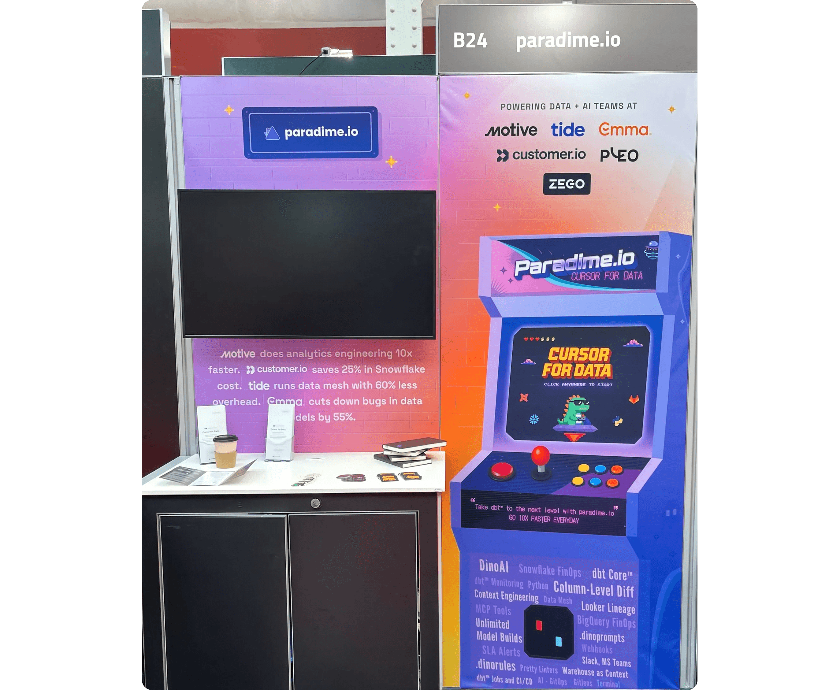
Paradime booth design at Big Data London 2025
The concept felt right: users playing through their 2025 like it was a game. Metrics revealed like arcade tickets printing out. A final character card as their reward. It had that playful, nostalgic energy our data engineering audience would appreciate.
Why This Matters for dbt™ Users
Paradime is a Code IDE for dbt™ development. Our users are data engineers and analytics engineers who live in SQL, YAML, and version control. They build data transformation pipelines, orchestrate workflows, and increasingly leverage AI for development acceleration.
The Year-in-Review needed to reflect three distinct dbt™ workflows we see daily:
1. AI-Assisted Development
Using DinoAI for dbt™ model generation
AI-powered commit suggestions
Natural language to SQL translation
2. Hands-On Modeling
Terminal commands for dbt™ Core operations
Manual model building and testing
Direct interaction with dbt™ CLI
3. Pipeline Orchestration
Managing dbt™ schedules
Running production pipelines
Monitoring and debugging data workflows
Each behavioural pattern maps to real dbt™ practitioner archetypes. The goal wasn't just gamification—it was creating a mirror that reflected how our users actually work.
Designing the Archetype System
Before I could build anything, I needed to solve a bigger problem: what were we actually showing users?
From Metrics to Characters
We had dozens of possible metrics from our dbt™ platform. The temptation was to show everything, but the goal was meaningful insight, not overwhelming dashboards.
We identified the behaviors that actually mattered:
AI-powered development: DinoAI conversations + AI-generated commits
Hands-on dbt™ modeling: Terminal commands for building data models
Pipeline operations: Deployed schedules + manual pipeline runs
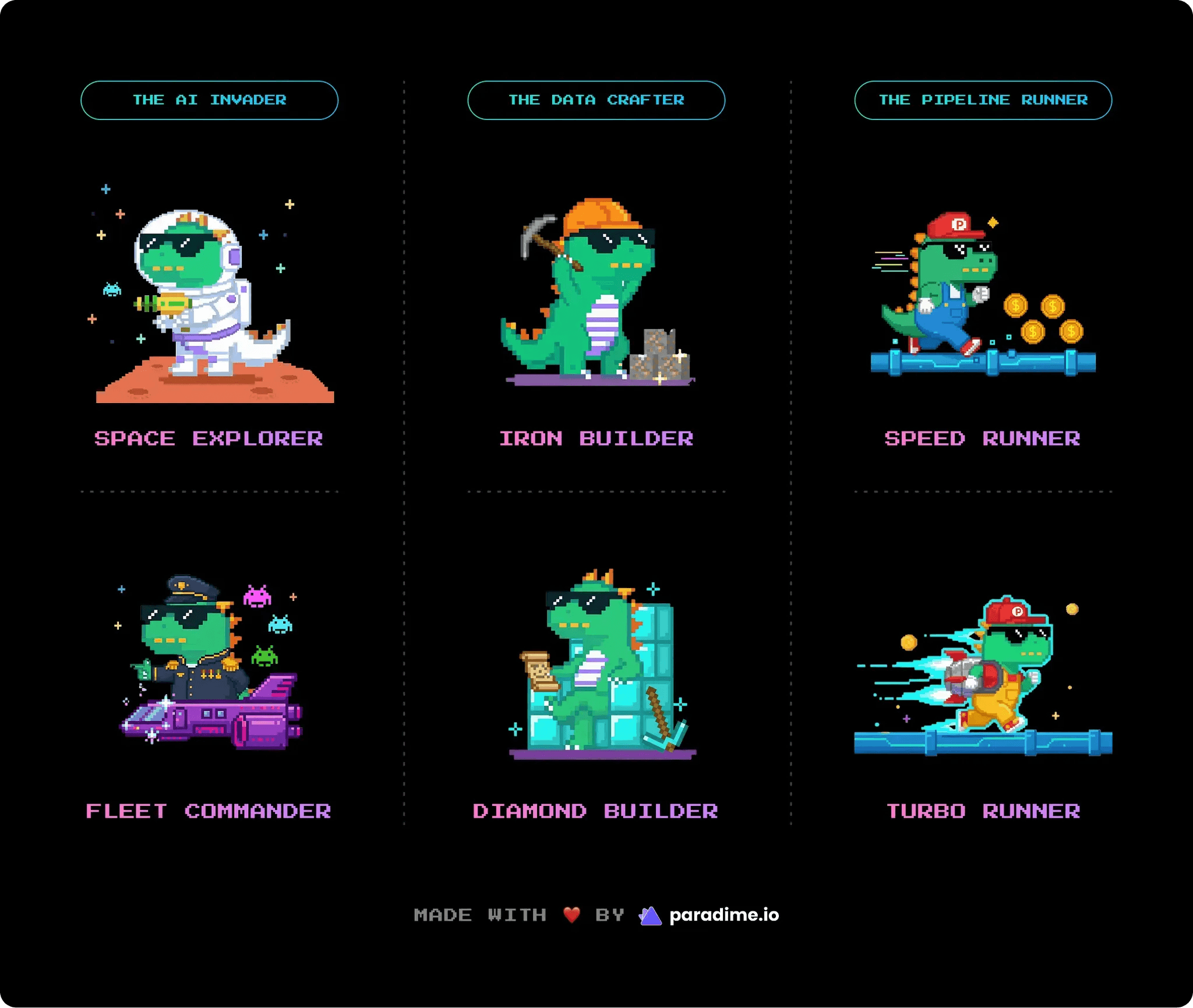
Three distinct ways people use Paradime. Three behavioral patterns. Three character families.
Each family drew inspiration from classic games our audience grew up with:
AI Invader (Space Invaders) - for AI-first developers
Data Crafter (Minecraft) - for hands-on builders
Pipeline Runner (Sonic/Mario) - for orchestration experts
Why Archetypes, Not Levels?
I originally considered using levels. Level 1, Level 2, Level 3. Simple progression.
But how do you compare an AI-heavy user with a hands-on dbt™ builder? Who's "higher level"? There's no right answer. More importantly, if this Year-in-Review gave someone the "gold tier" character, what would they collect in the long-term achievement system Fabio envisioned?
The insight: this wasn't about progression. It was about identity.
Not "what level are you?" but "what kind of practitioner are you?" Like a personality quiz. Like choosing your class in an RPG.
So I landed on archetypes. Behavioral identities, not rankings. Each with two tiers: active participant versus advanced practitioner. Names that felt aspirational without being out of reach:
"Space Explorer" for someone who's started using AI
"Fleet Commander" for someone who's deeply integrated AI into their workflow
Both feel good. Neither feels like the top or the bottom.
Technical Implementation: The Scoring System
Here's where it gets technical. We needed to compare disparate metrics fairly. A user with 50 pipeline runs shouldn't automatically rank higher than someone with 100 AI conversations.
The Z-Score Solution
We used Z-score normalization to make metrics comparable. Z-scores measure how far each person is from their group's average, preventing large-number metrics from dominating smaller ones.
Why Z-scores?
Prevents large-number metrics from overwhelming smaller ones
Measures relative position within the user distribution
Allows meaningful comparison across different measurement scales
Handles outliers gracefully
Tier determination
Once we identified the dominant archetype, raw metric values determined the tier:
Tier 1 (Active): Above minimum threshold
Tier 2 (Advanced): Above 75th percentile for that archetype's key metrics
What We Excluded: Hours Saved
One metric we deliberately excluded: hours saved from AI assistance.
Why?
Double-counting risk: Highly correlated with AI conversations
Imbalanced application: Only applies to AI Invader family
Outcome vs. behavior: It's a result, not a behavioral pattern
We do display it in the final results with a smart threshold: 8+ hours converts to work days. "That's 3 work days saved!".
Data Pipeline Architecture
The technical stack:
Paradime using dbt™ to process raw user activity data
BigQuery stores the transformed, analytics-ready datasets
Cube API provides the data layer with aggregations and metrics
Figma Make consumes the Cube API and renders the experience
Iframes to deploy the experience directly into the Paradime app
This architecture kept the data pipeline separate from the UI layer, allowing rapid iteration on the frontend without touching data infrastructure.
Building the Experience: AI Tooling Strategy
Here's how I used multiple AI tools strategically throughout the build.
The AI Tool Workflow
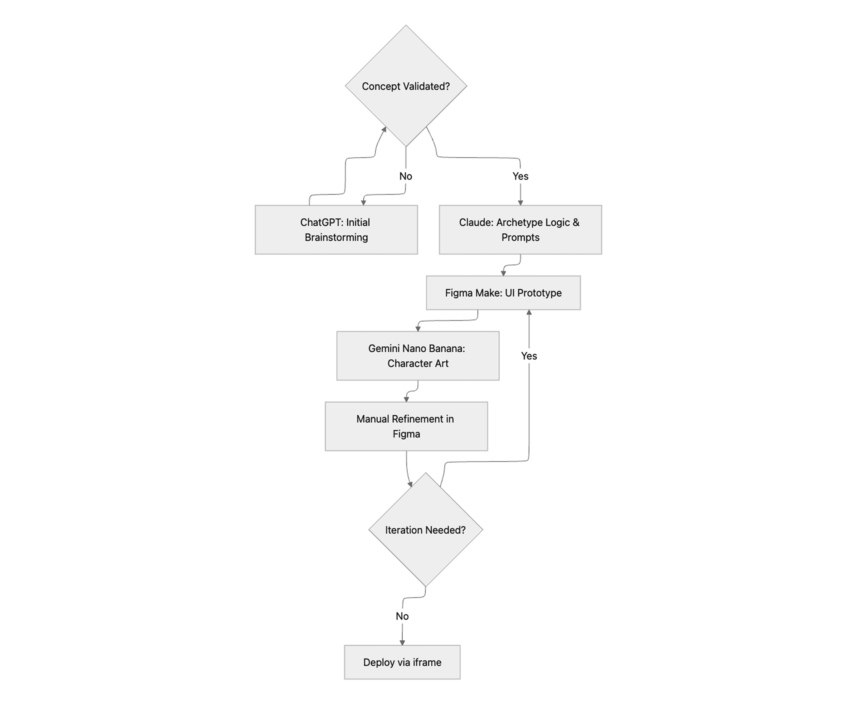
Each tool had a distinct role:
ChatGPT (with voice transcription)
Perfect for brainstorming and thinking out loud
Used for exploring UX flows and game mechanics
Quick conceptual validation
Claude
Archetype assignment logic and threshold calculations
Image generation prompt engineering
Technical problem-solving and code structure
Figma Make (powered by Gemini)
Primary UI construction tool
Interactive prototyping with real animations
Rapid iteration on layouts and interactions
Gemini Nano Banana
Character illustration generation specifically
Style consistency across the six dino archetypes
Asset creation with reference image support
Manual Figma Editing
Final polish on generated designs
Precise adjustments AI couldn't nail
Brand consistency checks
The Tool Switch That Changed Everything
I wrote up a prompt describing the entire arcade flow: the attract screen, the ticket printing animation, the scratch-off reveal, everything. I initially fed it to Gemini, but hit usage limits.
Then I remembered Figma had just launched Figma Make, powered by Gemini 3.0. I pasted the same prompt into Figma Make.
What came back was surprisingly good. Not just code, but an actual interactive prototype with the arcade feel I'd imagined. The flow made sense. The transitions had personality.
But here's where Figma Make had an unexpected advantage: I could take any frame it generated and copy it directly into Figma to edit as a designer. Not as code, but as actual design elements I understood. Gradients, patterns, vectors. Everything was suddenly editable in my native environment.
That changed everything. I could iterate at designer speed, not developer speed.
Execution Challenges: What Didn't Work
Let me be honest about the limitations. Not everything AI touched turned to gold.
1. Original Illustration Generation
Figma Make struggled with creating original illustrations from scratch. I originally envisioned a cinematic opening: zooming into an arcade machine, the screen flickering to life, a game-style boot sequence.
I provided reference images from our booth design, tried multiple angles and art styles, gave explicit instructions.
Result: It couldn't generate a recognizable arcade cabinet or execute the camera movement I imagined.
Solution: I simplified. Instead of the elaborate zoom-in sequence, we just start with a game screen. The arcade aesthetic comes from UI elements and interactions, not from illustrating the physical machine.
Lesson: Constraints breed creativity—or at least, simpler solutions that actually work.
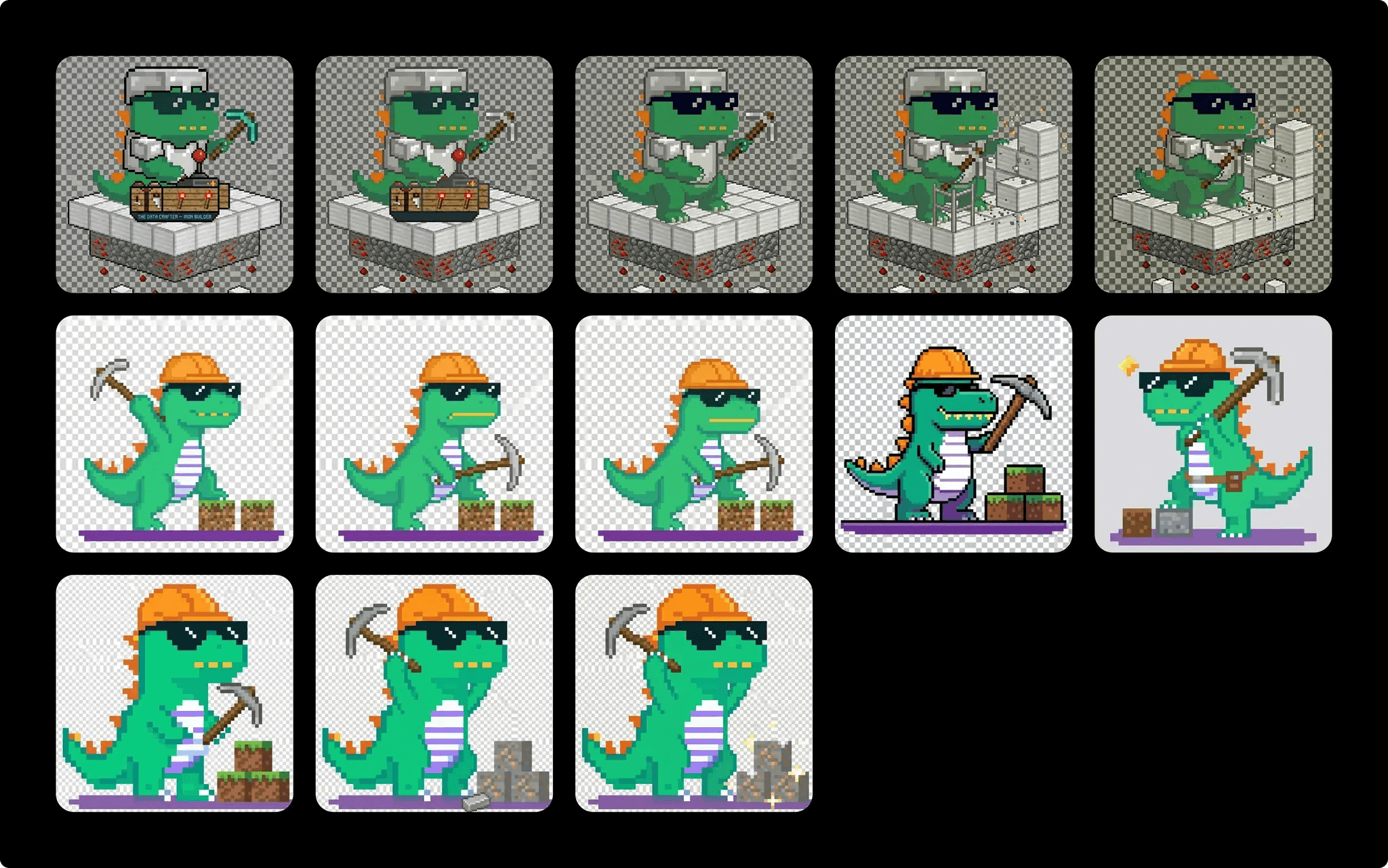
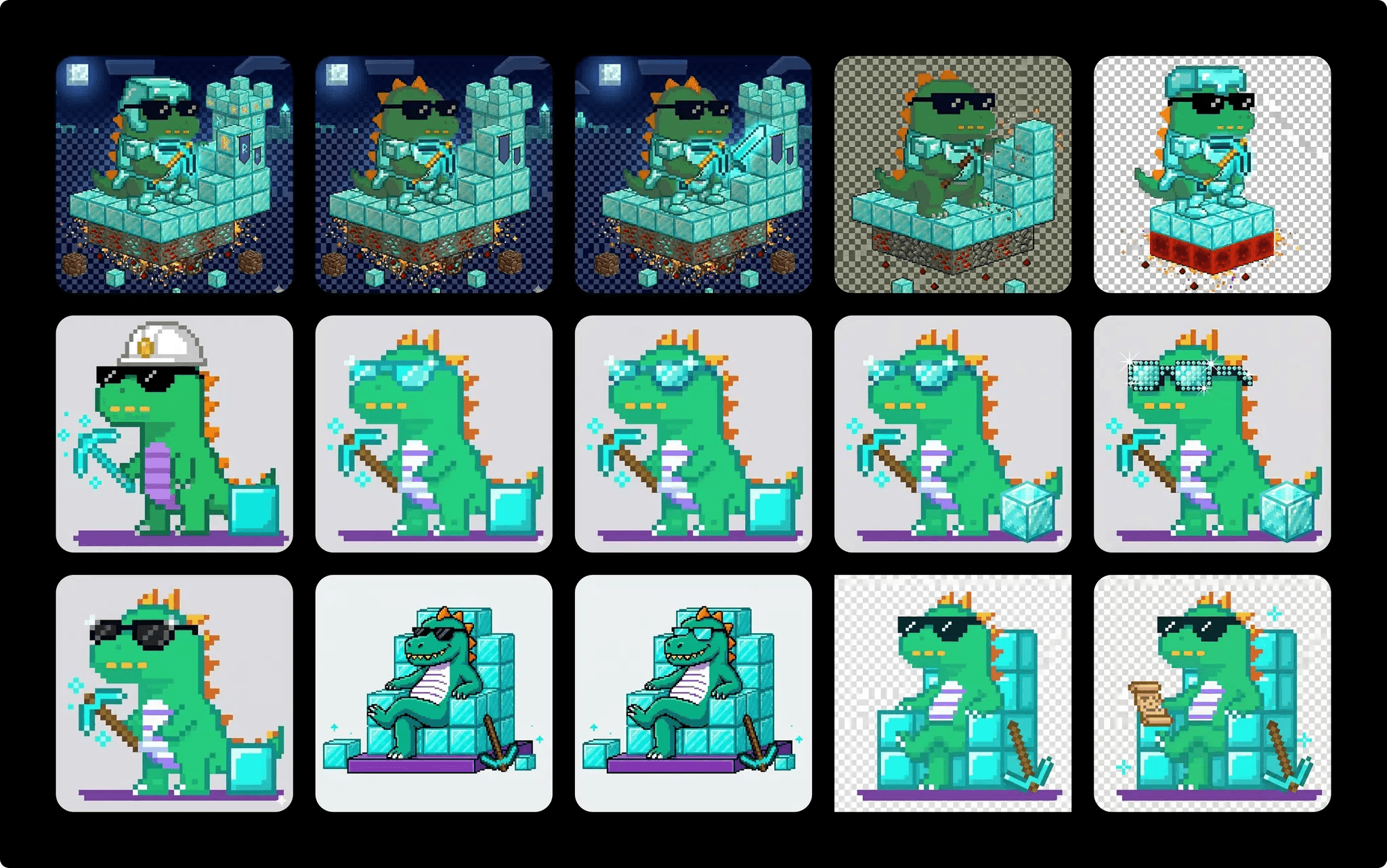
2. Character Consistency Battle
I needed six character illustrations: our Paradime dino mascot dressed as each archetype. Tier 1 and Tier 2 for each family.
The problem: AI is incredible at creating something new. Surprisingly tricky at creating something consistent.
Every character attempt gave me a different dino. Different proportions. Inconsistent details. The AI wasn't remembering what our dino looked like.
The breakthrough: a three-step process
Claude generates a detailed prompt with exact body specifications, while adding gesture/accessory variants
Gemini Nano Banana generates the image with our reference dino attached every time
Claude reviews and suggests tweaks (rarely perfect on first try)
The key: attach references every single time. Be extremely specific about what you want and what you don't.
Once close enough, I finalized in Figma using manual edits and Figma's AI image features.
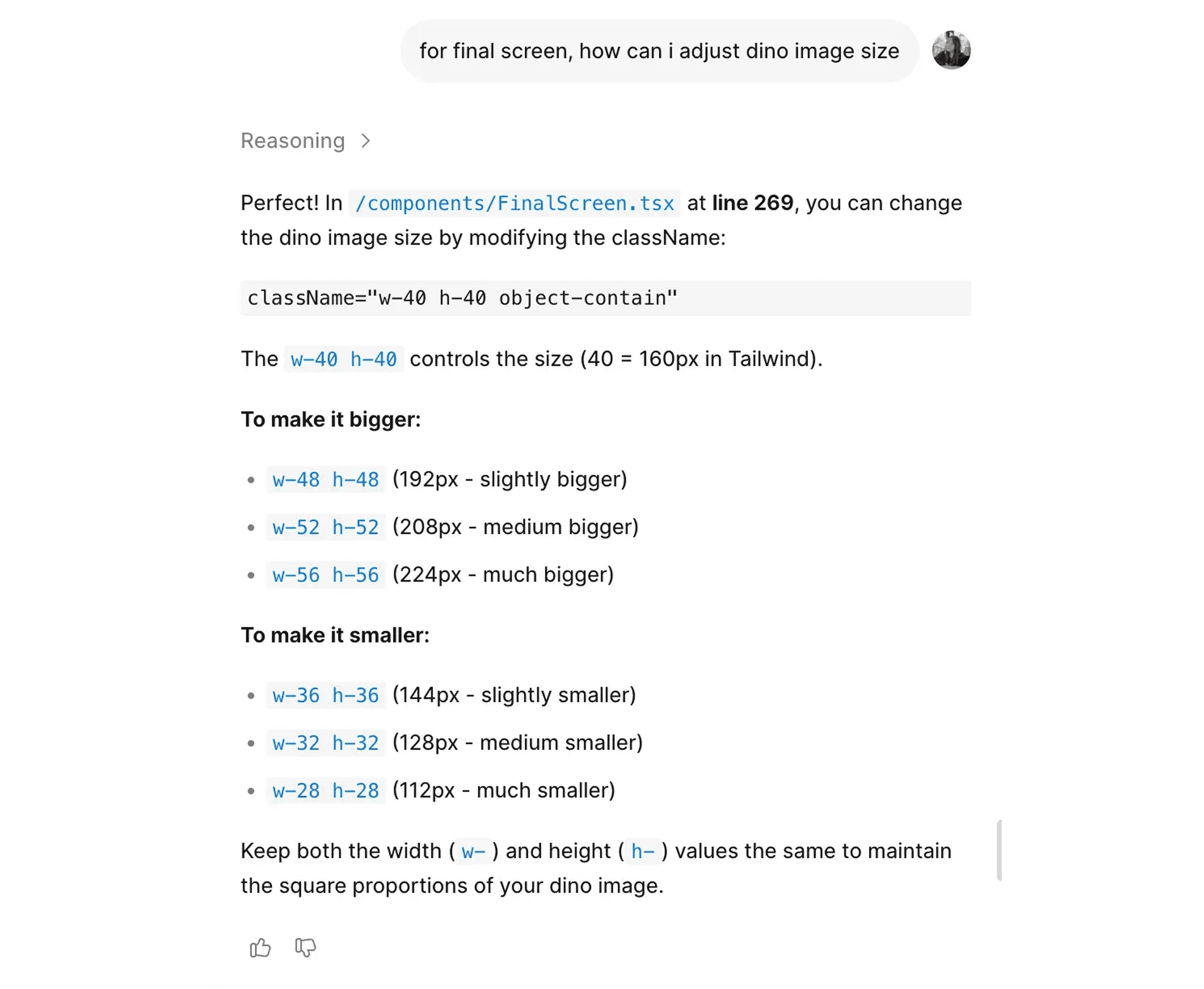
3. Fine-Tuning Small Details
Adjusting tiny details was surprisingly frustrating. It took me hours to make specific elements smaller or bigger.
The problem: Generated code used CSS classes. When I'd ask to "make this text smaller," the AI would change the class, affecting ten other elements I didn't want to touch.
The solution: I learned to ask differently.
Instead of: "Make this text smaller"
Ask: "Where in the code is this text size defined?"
Figma Make would tell me: "Line 227 in the DinoCard.tsx file." Then I could manually adjust just that one instance.
Lesson: Sometimes the best use of AI is asking it to teach you where to make manual edits.
Creative Breakthroughs
Some of the best ideas came from iteration and happy accidents.
Diamond Builder Evolution
Diamond Builder (Tier 2 Data Crafter) went through a major evolution. I initially wanted the dino standing with a diamond pickaxe and a hard hat. Functional, but boring. Not much different from Iron Builder except shinier.
Then I thought about our existing UFO character, sitting relaxed on the spacecraft. What if Diamond Builder was sitting too? But sitting on what?
A throne. Made of diamond blocks.
That single idea transformed the character. Now the dino wasn't just working—they were resting on their accumulated achievements. Confident. Complete. Blueprint scroll in one hand, diamond pickaxe on the ground. The visual storytelling clicked into place.
3D Card Hover Effect
I originally planned a scratch-off effect for revealing the character card, like a lottery ticket.
The problem: It was clunky. You had to drag your mouse back and forth repeatedly. Not satisfying.
On a whim, I asked the AI: "Can you create a 3D card hover effect instead?"
It generated one immediately. Perfect lighting. Smooth tilt based on mouse position. Background elements that shifted with the card. The kind of effect that would normally require significant CSS work and testing.
Lesson: Some things AI handles effortlessly. Others require extensive iteration. The skill is learning which is which.
Solving Critical UX Problems
Challenge 1: The Download Problem
Users needed to share their results on LinkedIn. Should have been simple.
Attempt 1: Add a share button that opens LinkedIn with a screenshot
Problem: Screenshot functionality wouldn't generate reliably across browsers
Attempt 2: Copy as URL
Problem: Used Figma domain, required public access (security issue), not optimized for social sharing
Final Solution: A hidden pre-rendered frame
Create an exact duplicate of the results screen in a hidden frame with key changes:
Remove all CTAs and interactive elements
Add Paradime logo and "Made with ❤️ by Paradime" branding
Optimize dimensions for LinkedIn (1200x628px)
When users click download, they get this pre-built, perfectly formatted asset as a PNG. No screenshot API needed. Perfect formatting guaranteed. Includes branding. Optimized for sharing.
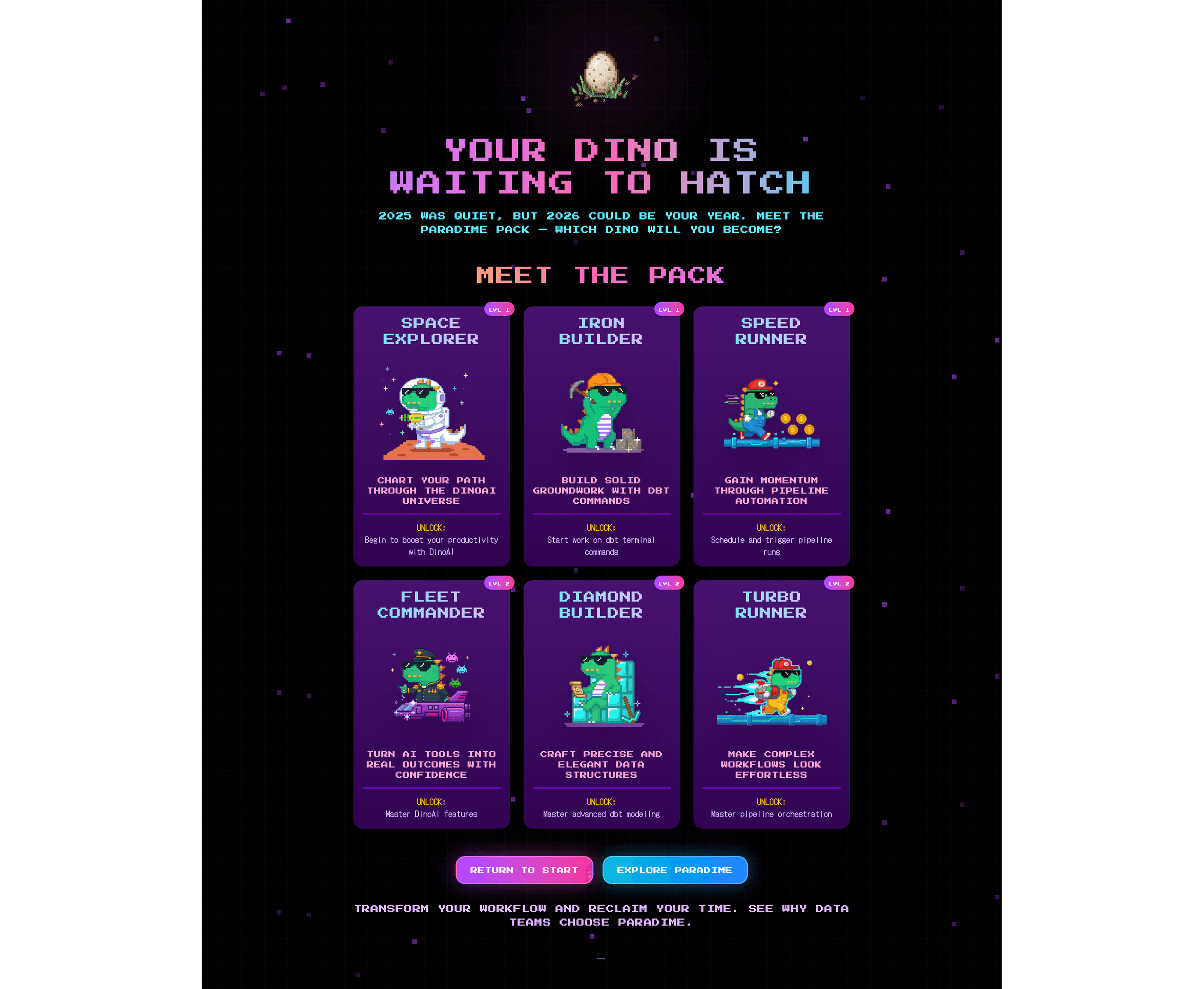
Challenge 2: The New User Problem
Some accounts were new. Some were trying it out. So we did not have enough data to make the Year in Review meaningful.
The wrong approach: Show them a year full of zeros and give them a character card they didn't earn. That's not motivating—that's depressing.
We created "Meet the Pack." Instead of showing your stats, you'd see all six character archetypes displayed together. Three columns (one per family), two tiers per column.
The headline: "Your Dino is Waiting to Hatch." 🐣
Not "you didn't do anything." Not "you missed out." Just: your journey starts now. Here's what's possible. 2026 could be your year.
It turned a potential disappointment into an invitation.
Challenge 3: The Distribution Decision
How would users actually see this experience?
Option 1: Send an email with a link
Problem: Responsive design in Figma Make wasn't reliable
Mobile, tablet, desktop—all different screen sizes
Experience would break, layouts would shift
Option 2: Embed as an iframe inside the Paradime app with fixed aspect ratio
Advantage: Paradime is already a desktop web application
Users are in the right environment
Complete control over viewing experience
No responsive layout headaches
We ultimately merged the to options, using loops.so to announce the Year in Review via email, with a one-click CTA to reveal it inside the app. We locked the aspect ratio with the iframe, ensuring consistent rendering across all desktop browsers, while distributing to every user in the platform.
Key Learnings: AI as Collaborator
1. AI Didn't Replace Design Thinking
The critical insights came from human reasoning:
Archetypes over levels (identity vs. progression)
Inactive user empathy (invitation vs. shame)
Diamond Builder's throne (storytelling through composition)
Z-score normalization (fair comparison logic)
AI accelerated execution. The thinking was mine.
2. Iteration Is the Process, Not a Failure
226 versions isn't a failure metric—it's a process metric.
Version 42: Good enough to show the team
Version 226: Good enough to ship
Neither was perfect. Both were progress.
This speed came from end-to-end ownership. No handoffs. No waiting. When something didn't work, I pivoted immediately.
3. Strategic Tool Selection Matters
Different AI tools excel at different tasks:
Tool | Best For | Avoid For |
|---|---|---|
ChatGPT | Brainstorming, voice-to-text thinking | Final code generation |
Claude | Logic, algorithms, prompt engineering | Image generation |
Figma Make | UI building, interactions, rapid prototyping | Original illustrations |
Gemini Nano Banana | Character art with references | Code structure |
Manual Figma | Final polish, brand consistency | Speed iterations |
4. Know When to Simplify
The elaborate arcade machine zoom-in didn't work. Instead of fighting the tool for days, I simplified the concept.
The result was better: faster to load, clearer user experience, less cognitive overhead.
Sometimes constraints lead to better design.
5. End-to-End Ownership Enabled Speed
Traditional handoff process:
Designer creates mockups
Engineering reviews feasibility
Back-and-forth on edge cases
Engineering builds
Design QA
Iteration cycle repeats
AI-enabled solo build:
Design and build simultaneously
Test immediately
Fix immediately
Ship
Result: 10 days instead of 4-6 weeks.
Practical Takeaways: How to Reproduce This
Want to try this approach on your own project? Here's the framework:
Prerequisites
Figma account with Make AI access
Claude API access or ChatGPT Plus
Clear product requirements and success metrics
Reference designs and brand assets
Willingness to iterate extensively
The Process
Week 1: Design & Core Build
Brainstorm in ChatGPT (voice mode is excellent for thinking out loud)
Define technical logic with Claude (algorithms, scoring, thresholds)
Build initial UI in Figma Make (start with detailed prompt + references)
Iterate using Figma's native editing + AI refinement loop
Review with stakeholders, gather feedback
Week 2: Assets, Integration & Polish
Generate custom assets (use Gemini with consistent references)
Integrate with data sources (APIs, databases, etc.)
Test edge cases (what if user has zero activity? what if metrics are extreme?)
Polish interactions (animations, transitions, micro-interactions)
Deploy and ship (iframe embed, URL, or other distribution method)
Time Expectations
Simple interactive prototype: 1-2 day
Feature with custom assets: 3-7 days
Full product with data integration: 7-10 days
Note: Complexity varies. Your mileage will vary based on technical requirements and iteration cycles.
What's Next for Paradime's Year-in-Review
This was Paradime's first Year-in-Review. For 2026, we might explore:
Third tier archetypes for power users
More interactive micro-games within the flow
Team-based achievements for collaborative workflows
Richer animations and transitions
Expanded metrics as dbt™ features grow
Or we might keep it exactly as is. The simplicity worked. Sometimes iteration means knowing when to stop.
The Real Takeaway: Start Small, Ship Fast
I started experimenting with Gemini out of curiosity. I built a dbt™ explainer, an icon library, some small projects. None were intended to become products.
But the experimentation taught me what was possible. It lowered the stakes. It gave me the confidence to say yes when the opportunity came.
If you're curious about AI tools but hesitant:
Start with small experiments. Pick something you genuinely care about, not something you have to ship. Learn the tools' strengths and limits. Figure out when to be specific, when to trust them, when to simplify.
You might be surprised where it leads.
Resources & Further Reading
Tools mentioned:
Paradime resources:
Learn more about DinoAI for dbt™
Watch on Youtube for a detailed walkthrough


